The Roaring Twenties
an interactive exploration of the historical soundscape of New York City
By Emily Thompson
Design by Scott Mahoy
Our time machines thus ultimately and necessarily return us to our selves, and the sonic time machine that is The Roaring 'Twenties is no exception.
- Emily Thompson, The Roaring 'Twenties
Alternative views of The Roaring Twenties project data:
 All info and conversations from this project page
http://vectors.usc.edu/xml/projects/theroaringtwenties_v1.xml
 RSS feed of the conversations from this project page
http://vectors.usc.edu/rss/project.rss.php?project=98
http://vectors.usc.edu/xml/projects/theroaringtwenties_v1.xml
http://vectors.usc.edu/rss/project.rss.php?project=98
Designer Statement
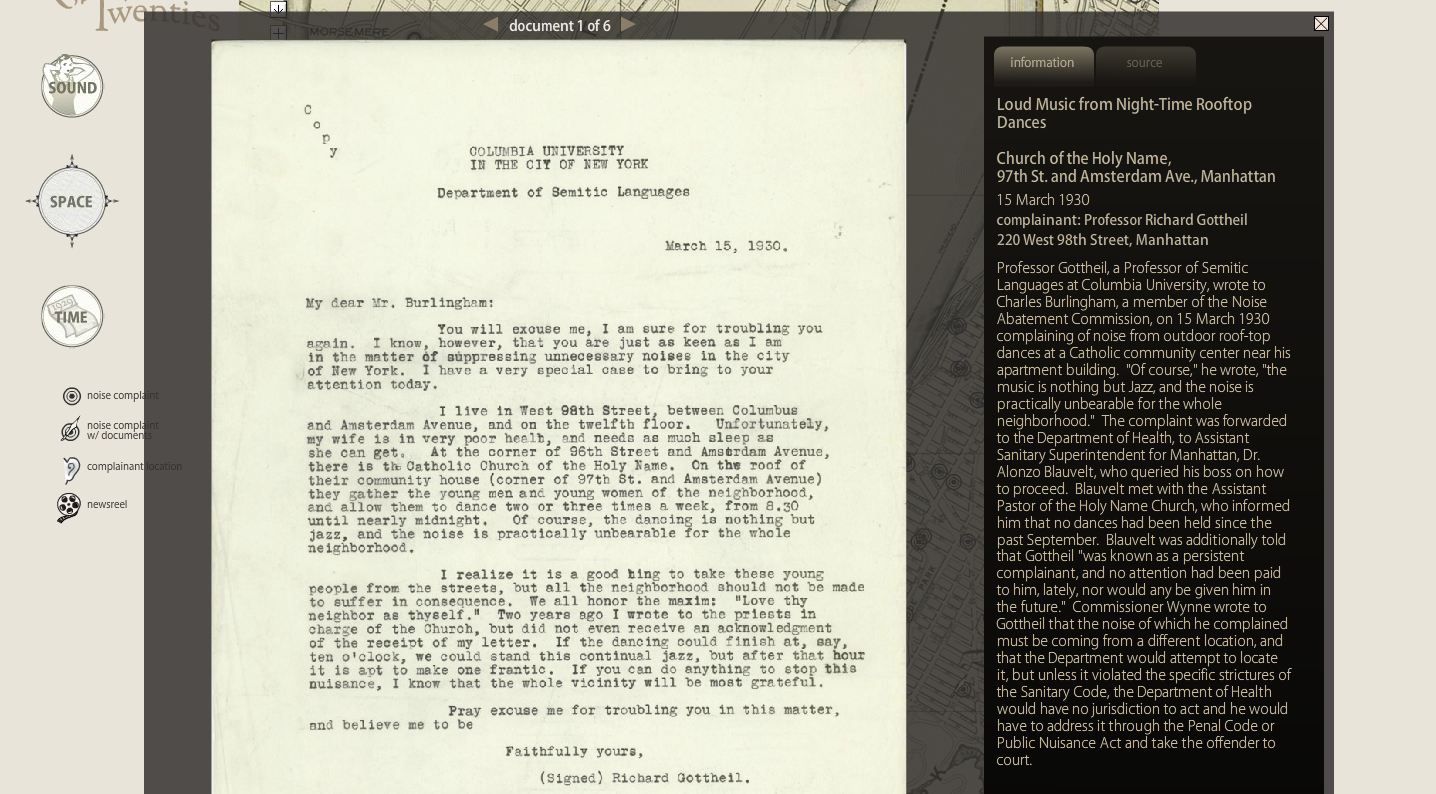
This project takes a unique approach to understanding our cultural history, via an exploration of the changing soundscape in New York City circa 1930. Emily Thompson gathered a rich collection of archival materials for the piece, including over fifty newsreels from the late 1920s, nearly 600 noise complaints, and a collection of related newspaper and magazine articles. We focused on presenting the materials primarily through a spatial interface. NYC's landscape was quickly being transformed at this time, and that transformation produced an array of new and unique sounds emanating from specific locations. We wanted to plot these locations in an interface that reflected the era, so Emily searched for a map of the city from that period. She discovered a 6-foot-high, historical map of New York City on eBay. She had the digital team at Princeton scan the entire map, piece by piece, until it was completely digitized at high resolution. I then took this digitized image and broke it down into "tiles" that could be used by the Google maps API. To enable seven different zoom levels within Google maps, we ended up with over 19,000 different tile images that are then reconstructed on the fly as you zoom and navigate spatially within the map interface.
The other interfaces take the same archival material and organize them in different ways through sound and time. The presentation of the materials in these different but related ways allows a more complete picture of the era to be formed and a deeper understanding of it to emerge for the user.
As one explores the rich archive contained in this piece, the personal experiences of the characters within begin to come alive - from the passionate pleas expressed in beautifully handwritten letters, to the lengthy exchanges with commissioner Wynne, to the wide array of noises complained about including loud neighbors, "maniacal laughter . . . enough to drive one mad", roosters, radios, and the list goes on. One cannot help but imagine some of the characters energetically penning their complaints. Or the Bell Labs scientists jutting around NYC in their little "roving noise laboratory" truck filled with an "official measuring apparatus." I can't help but find this image amusing. As with many modernist attempts to stay ahead of the rapidly changing technological landscape, they go at it with gusto, armed with a bevy of precise scientific tools and methods all intended to somehow control the new technologies, yet still seemingly celebrating their newness at the same time. As one who sometimes becomes obsessive about whatever my own latest interest happens to be, I can relate and can't help but laugh a little at the recognition of my own occasional over-zealousness. As you explore the project on your own, I imagine you too may relate to some of the characters within, perhaps to someone penning a noise complaint about traffic, loud construction work, or a neighbor who just won't be quiet. Good narrative and design allow us to see our own experience reflected back in the experiences of others. This interactive project hopes to allow such an experience in a unique (and audible) way.
— Scott Mahoy, June 23rd, 2021


