
Digital Dynamics Across Cultures
Design by Alessandro Ceglia
Designer's Statement
When I first spoke to Professor Kim Christen and Chris Cooney about the design for Digital Dynamics Across Cultures, I was immediately struck by the challenge (and the apparent paradox) of building an interactive piece that centered around information that could not be freely shared. Kim had amassed this vast library of images, videos, and recordings of Warumungu society, precisely the kind of content that one would normally want to display, but that, in the context of this project and Warumungu culture, could not be openly viewed. If we were going to make our point, it couldn't be through what we showed. It would have to be through what we didn't show or what we chose to conceal.
THE BACKEND
The first step was to store and organize all of Kim's content in a database. A database would give us flexible control. Craig Dietrich and I set up a system whereby Kim and Chris can easily update, modify, add or remove content, and, most importantly given the cultural protocols they are dealing with, control whether or not a particular image, video, or other element appears online.
Because of the sheer quantity of content, Craig and I then set about creating an algorithm that sifts through the database and pulls a representational assortment of content which I then use to populate the Digital Dynamics Across Cultures site (the frontend) -- enough content for Kim to make her point but not too much so as to overwhelm the user. This algorithm also ensures that each visit to the site is unique: each visit uses a different assortment of content to make the same argument.
THE FRONTEND
I should begin by saying that the site itself, what you see when you access the project, is completely dynamic in all aspects: from the number of places that appear on the map, to the images and text displayed on the page, they are all determined by and will vary based on what Kim and Chris upload to the database.
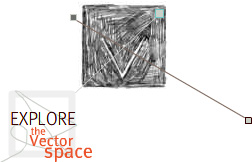
So how should the user experience all of this content? Since place is a defining element in Warumungu society, I chose an abstract painting of a map of the Warumungu community as my initial source of inspiration for the primary navigation system. Kim, Chris and I all agreed, however, that we shouldn't get overly literal in our implementation of a map, so the interface was never intended to function as a "real" map. The relative position of each place remains constant to give the interface a sort of geographical grounding, but the map the interface represents is not to scale and the geographical relationship between each place is only roughly approximated. Moreover, much like the content that populates the site, the absolute position of each place varies with each visit. In effect, the places aren't really physical places at all -- more like digital repositories of cultural information (some of which is inaccessible) hovering around a digital focal point... much like the site itself, floating somewhere out there in cyberspace.
The secondary interface, that kind of single-celled organism that splits and divides when interacted with, was also inspired by Warumungu paintings, but, for me, also captures the spirit of exploration that the site demands from the user. Dig around a little, and see what pops up. Learn about the protocols through direct experience, as you travel through this virtual landscape and interact with its inhabitants, and not only by reading about them in a book.
The protocol elements that appear throughout the site (the pop-up windows, the tape mask) and that are ultimately the central focus of the project are meant to be jarring and slightly disruptive. We want the user to come across a few road blocks as he or she explores the site, and to have that experience be educational, a kind of negative reinforcement, if you will.
- Editor's Introduction
- Author's Statement
- Designer's Statement
- Producer's Statement
- View Peer Response + Discuss
- Project Credits
- VIEW PROJECT
-
Project Technologies
Plug-in(s) you will need to view this project:
Flash 8 Plug-In Browser application providing fluid vector-based graphics and interfaceDevelopment and data handling applications:
AJAX Asynchronous JavaScript and XMLMySQL 5.0 Open-source relational databasePHP 5.0.4 PHP Hypertext PreprocessorXML Extensible Markup Language